


A Travel App for Explorers
It can be hard for people to know where there are places that are worth checking out when visiting a new area. How can we help improve this experience for people when they travel?
My Role
User Research
User Interviews
Site Architecture
Sketching
Wireframing
User Flow
User Interface Design
Interaction Design
Tools
Sketch
Invision
Miro
Pen & Paper
Project Length
6 Weeks
Quick Contents
The Problem
The Avid Adventurer needs a way to be able to curate and plan authentic travel experiences because they want to ensure they have an efficient and memorable time when travelling.

What does the current travel recommendation landscape look like?
For a competitive analysis, I looked at Foursquare, TripAdvisor and Google maps to gain insights into how they work and what they offer in terms of experience and value .
TripAdvisor currently dominates the travel market because it covers an end to end experience of booking and travelling for users.
Both Foursquare and Google Maps rely on user generated content to help provide the recommendations on their services.
The majority of people plan their travel on the go so I decided to design with a mobile first approach.
Competitor Strengths and Weaknesses
Foursquare
Strength - Utilises local user knowledge
Weakness - Conflates quantity over quality with recommendations
Design - Uses brand colours throughout app with focus on whitespace and imagery
TripAdvisor
Strength - Covers end-to-end travel experience
Weakness - No curation of user generated content
Design - Simple, minimalist clean design with a focus on images and user generated content
Google Maps
Strength - Travel and direction features
Weakness - Difficulty with list discoverability in the app
Design - Friendly, clean and minimal design with a focus on maps and imagery
User Research
From the user research I was provided with, it was clear that the target audience for this service were
Interested in Food and Culture
Young professionals who liked to plan trips in advance
Keen social media users
Want authentic travel experiences
All of the users expressed an interest in wanting to plan their experiences when travelling in advance of the trip.
Their biggest frustration were the unreliable tips and recommendations from user generated content, they want authentic and trustworthy information for recommendations.
Meet the Persona

Edward Copper
Edward is my primary persona who represents the audience demographic the app will be designed for. He loves travelling around the world and discovering places, and experiencing new, local cuisines where he travels. He dislikes going to places that don’t match up to the reviewed experience and not being able to plan and curate his own travel experiences.
His main goals are to:
Experience the local food scene wherever he travels
Meet new people and have memorable experiences when travelling
Application Map
Before ideating on a design solution, I wanted to consider the information architecture structure to show a proposed structure of the app.

Ideating with Sketches


These were some quick 6-8-5 sketches where I explored some possible design solutions to what the app experience could look like.
Mid Fidelity Wireframes
Following on from the sketches, I then designed a mid fidelity wireframe with the proposed solution I had come up with. It aimed to help curate the user experience by asking them to fine tune their recommendations based on where they were going and what they were interested in.

Design Exploration
Moodboards

Friendly and Aspirational
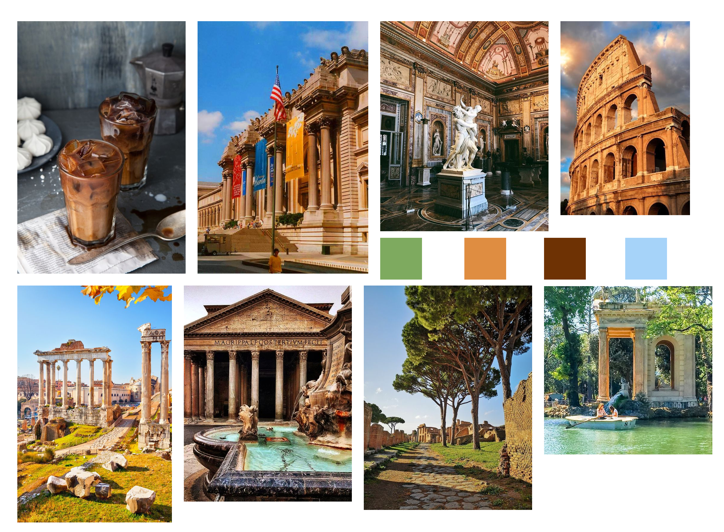
Rustic and Cultured
Style Tiles
I then took some of the mood and concepts introduced in the moodboards and then fleshed them out to create a style concept of what the application could look like.


High Fidelity Screens
After getting feedback on my style tiles, the Green and Orange style tested better and so I designed the high fidelity versions of the screens with that aesthetic in mind. Below are the high fidelity screens of the exploratory onboarding experience.

Splash Screen

Location Choice Screen
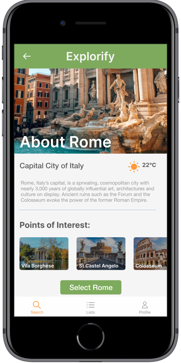
Location Information Screen

Interest Choice Screen

Explorify Results

Explorify Place Information
Final Reflections
Did I design an experience that allowed users
“to curate and plan authentic travel experiences because they want to ensure they have an efficient and memorable time when travelling”?
I took elements from the onboarding experience like where the user would want to travel to and what they were interested in to help narrow down recommendations for them. I also highlighted the fact that the recommendations were from Verified Visitors.
If I had more time, I would expand upon the verified visitor elements to show how they function within the app to help create a more trustworthy experience.