

Subly
Creating a full UX and UI redesign of the existing marketing site for Subly
For this project, I worked in a team with two UI designers and one UX designer. We were tasked with working on a full rebrand and redesign of the existing marketing site for the Subly Product. They wanted to appeal to a more broader and accessible audience.
My Role
Domain Research
User Interviews
Current Website Analysis
Card Sorting Exercises
Style Concept Deliverables
User Interface Design
Deliverables
Personas
Moodboards
Style Tiles
Logo
Wireframes
High Fidelity Screens (Mobile & Desktop)
Brand Design System
Team Members
Bijan Sherifi
Emi Bulai
Xavier King
Project Length
4 Weeks
Quick Contents
The Problem Statement
As a young freelancer, I need a quick and reliable way to upload, transcribe and customise content on my videos so that they can reach a wider, more inclusive audience
Design Principles
Accessible
To provide the same experience for every user making sure the design is inclusive for all users no matter their circumstance.
Reliable
Ensuring the design is accountable to the user’s expectations by following design guidelines, conventions and best practices.
Transparent
To keep the user updated and aware of the process from start to finish.
Establishing a Persona

The client already had a strong idea of the type of audience they wanted to attract with the rebrand. They gave us descriptions like “content creator”, “millennial” and “young professional” which we used to create the persona.
Zara Lily is a 25 year old Instagram Influence who wants to be able to promote and share video content with non-english speakers and she needs an accurate and easy to use transcription service .
Understanding the Competition
Competitive Analysis
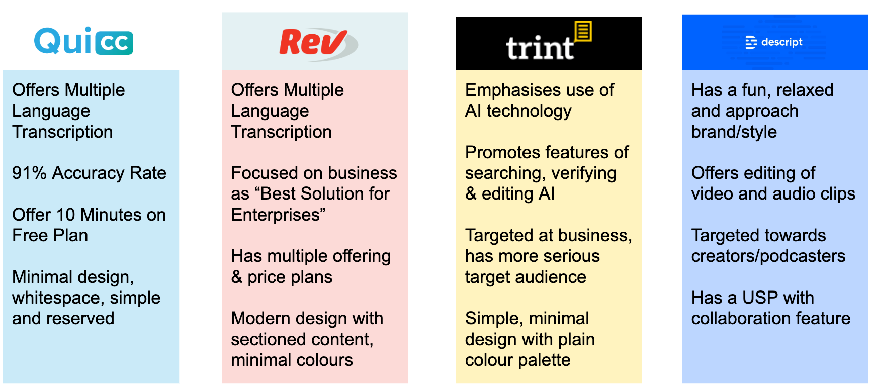
Competitor Product - Features
Across the competitors, their features weren’t communicated clearly on their marketing
None of the competitors offered both audio and video transcription and editing services
The usability and onboarding experience for non technical skilled users was absent
Competitor Visuals - Target Audience
The majority of competitors are aiming to target professionals and businesses in terms of users
Because of this, the design aesthetics came across more professional and serious on their websites
From a design perspective, there was nothing eye catching or appealing that grabbed attention
From this we were able to help identify a unique selling point for Subly…
All-in-one platform for Audio and Video transcription service!
User Interviews and Research
We conducted some user research to help understand the target demographic for the product and what users would expect from a automatic transcription service.
We conducted:
7 one to one interviews with potential users for 30 minutes
A design exploration survey which received 52 unique responses

Key Findings
50% of users would consider using a transcription service based on circumstance
Of these users, 95% agreed that accuracy was the most important feature, followed by ease of use at 72.5%
The main frustration for users were the time taken to transcribe manually and being unable to pin specific points in recordings
Visual Analysis of Previous Site

Sorting Cards with Users

Following on from the previous site analysis, we broke down the main components of the website into cards.
We asked people to arrange the components on the screen based on what would be the most important information for a marketing website, and what they expected to see.
From this, the most common components thats users would expect to see on a marketing site are:
Brand Logo
Clear Navigation across the website
Key Selling Points
Images showing the Product
Text and Information explaining the product
Testimonials from people who have used the product
This helped us create a basis for the wireframe structure of what the rebrand site should include, and how it could be structured.
Experimenting with Design Styles
Mood board exploration

We designed a series of mood boards to help explore different style aesthetics for the rebrand and decided to test them with people to see how they were interpreted.
These were based on a series of adjectives the client gave us that she wanted the rebrand to evoke:
Bright, Bold, Brash, Funky, Standout, Simple, Professional


We tested the moodboards we created by asking users to write down the words they felt associated with the visuals for each one. We wanted to test if the different mood styles: Bold, Colourful, Dark and Funky were coming across.
The Bold moodboard which I designed was the best received mood board along with the colourful mood board, so we decided to combine elements from both of us with our style direction moving forward.
Style Tiles
We then moved on to creating style tiles that were based off of the strengths from the testing of the mood boards, and taking into account the adjectives the client gave us. This was important as it was the start of us establishing design direction to help communicate to the client.

Bold and Bright

Colourful and Fun
Initial Screen Mockups
We then designed divergent screen mockups based on elements of the style tiles, and made sure to include features from the user testing like the accuracy of the product upfront and then tested them in a survey of 86 responses.
This helped the client visualise what the final product may look like.


In the survey, we asked the respondents to choose their favourite from the design mockups and to explain what they liked and disliked about their choice.
Key Insights
Out of 86 respondents, 37% preferred the 4th screen design mockup. The common positive feedback was:
“It clearly shows what service you are going to receive and the price you’re going to pay”
“The content is easy to read and it’s well organised. I love the colour palette as it’s fresh!”
“It follows a theme consistently, has nice graphics and conveys the message about the product clearly”
These results helped us solidify a final design direction for the high fidelity deliverables and brought the client on board with our design decisions. We took the feedback into consideration when iterating and designing the finalised versions of the high fidelity screens.
Finalising the Design Deliverables
Re-thinking the Logo
We were also given the option of rebranding the logo as well as the overall company design. We wanted to explore the theme of sounds and the S from the brand name, and incorporate into a logo design. Below are the initial concept ideas we came up with.

We then tested these to see users thought about them and what elements worked best to take forward in an iteration of the final design.

Finalised Logo Design
From the testing and feedback, we identified that the speechmark logo was the favourite and users appreciated the visual reference to sound. The client liked it as well, but they felt it was a bit too angular, so we iterated on it and settled on the below finalised version.

Below is a visual comparison of the old Subly logo with our new refined Logo where we have also addressed the issues like accessibility and contrast issues.

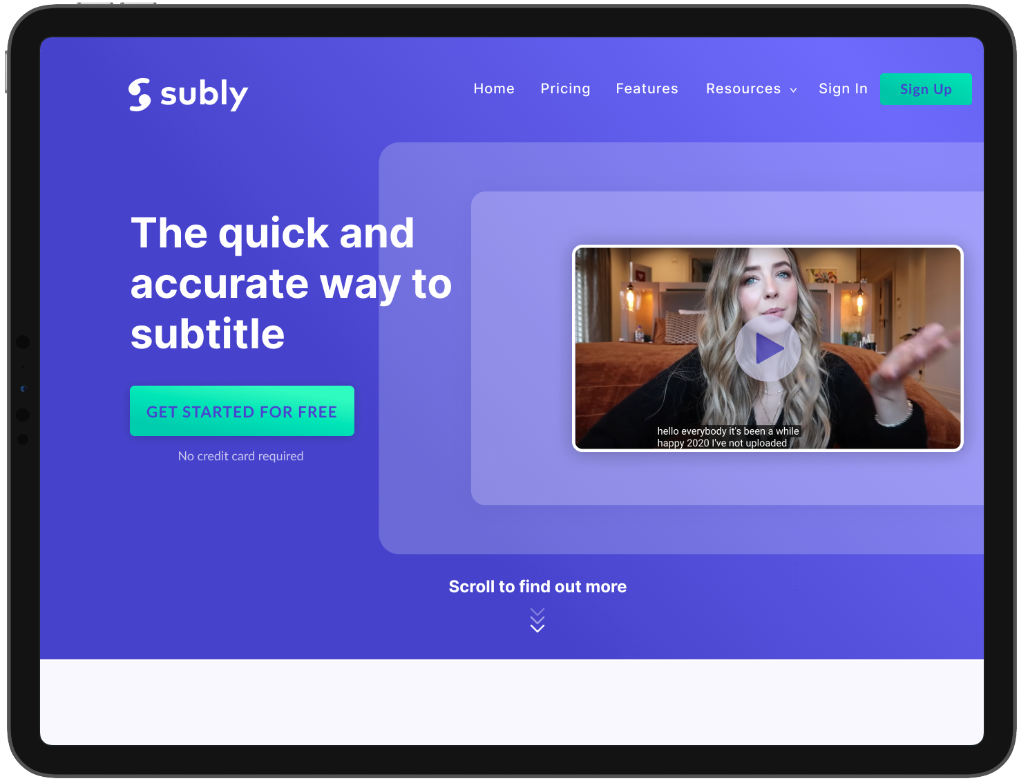
High Fidelity Screens

Homescreen Banner

Product Selling Points
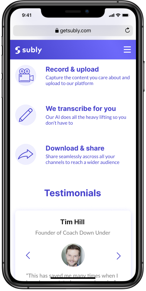
Product Features

Pricing Information

In Depth Feature Information

Support and FAQ
Previous Design VS New Site

Final Design User Testing
We conducted a final round of user testing of our high fidelity designs to find out if we had effectively addressed the issues raised with the previous website design.
11 one to one interviews with potential users for 30 minutes
Key Findings
82% of our users found the design clear & interesting and they loved the colour scheme.
We also found that 73% of the users found the Iconography caught their attention and helped them engage with the Key Selling Points of the product.
All of the users we interviewed described the product being marketed towards a young, millennial demographic.